

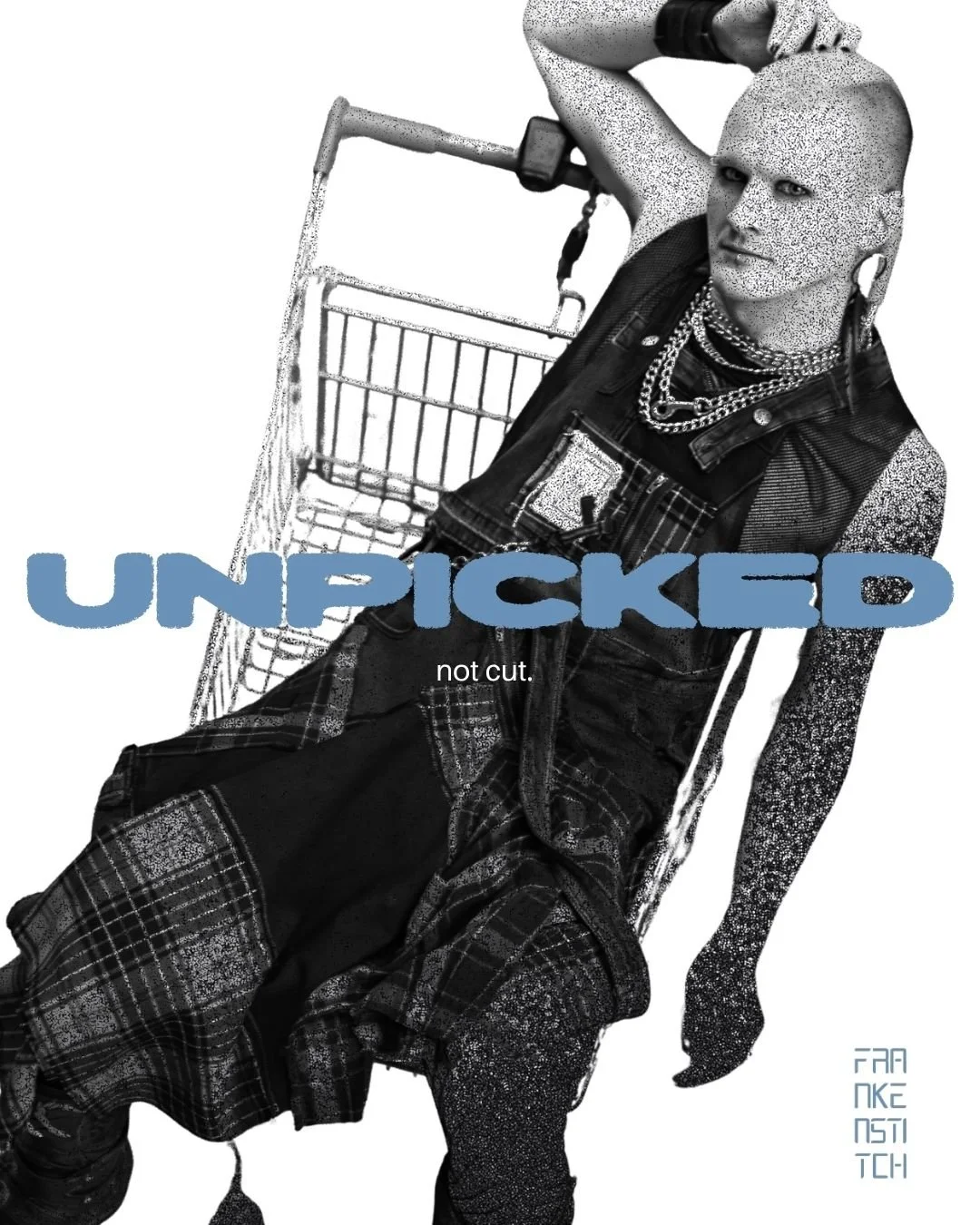
FrankenStitch
Reframing the value and edge of upcycling
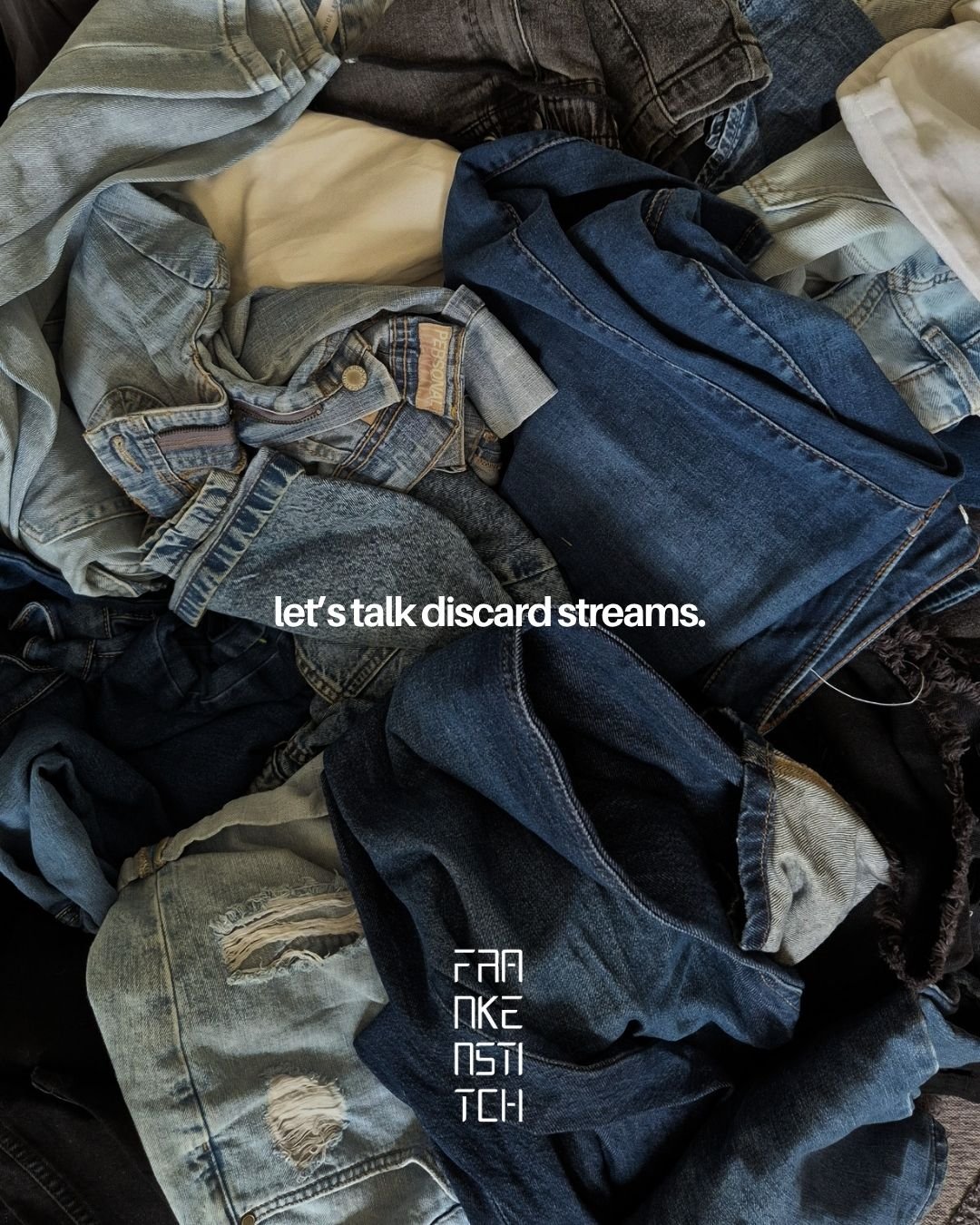
FrankenStitch is a Melbourne label working with garments fashion has already written off.
Founder Gina Sinclair pulls clothing from discard streams, cuts it apart and rebuilds it into one-off pieces defined by visible construction, altered proportions and a refusal of polish for polish’s sake.
The opportunity was to move the brand beyond the broad language of upcycling. That framing explained where the materials came from, but it flattened the labour, instinct and design judgement that made the work valuable.
Irigai developed an Eos Strategy reframing FrankeStitch amongst reconstruction, rarity and wearer identity. The focus shifted to what happens after a garment is discarded: the dismantling, reworking and rebuilding that makes every piece impossible to repeat.
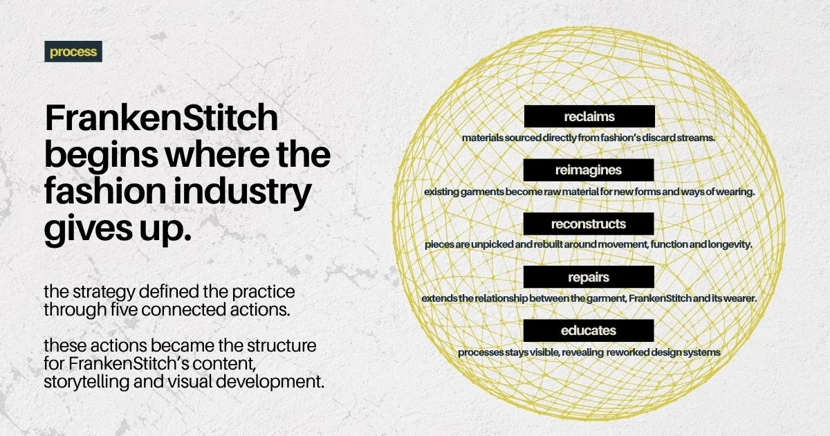
Our work moved the brand story away from rescue and towards reconstruction.
We looked beyond ‘upcycling’ to understand what FrankenStitch was really making visible: discarded material, skilled reconstruction, one-off value and clothing as a rejection of sameness.
FrankenStitch’s value sat in what happened after a garment was discarded: the cutting, rebuilding, distortion and decision-making that turned unwanted material into something singular.
-
We explored FrankenStitch’s purpose - its foundations and nuances, practices and processes, asking how we can translate that in a way that instantly lands,
-
Exploring those who will elevate the brand, we outlined four deep audience profiles. We gathered what they need from FrankenStitch and those attributes can be most effectively framed to them.
-
We outlined storytelling within FrankenStitch’s physical presence, from Melbourne’s fashion markets to concessions. With the brand present across a range of physical spaces, we refined how to keep consistency, depth and authenticity.
-
From outlining content pillars to consistency kits enabling the brand to remain anchored across different platforms, we developed frameworks to keep content relevant, structured and unique.
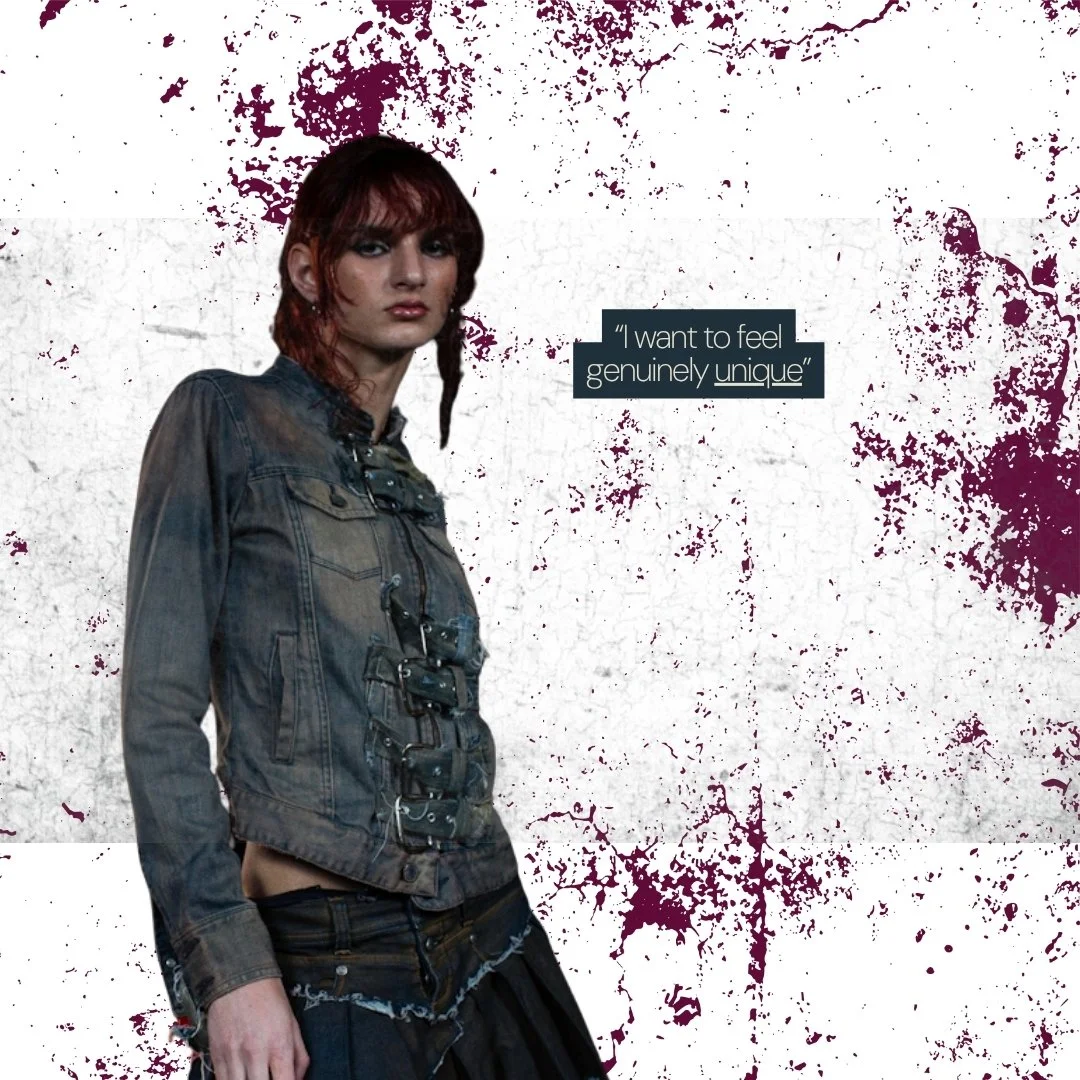
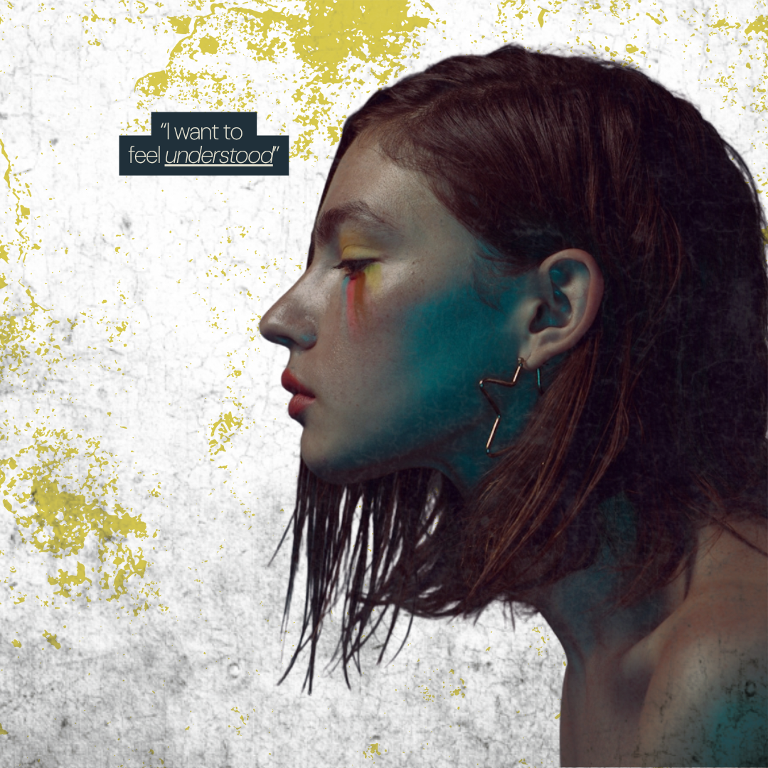
“Once I saw the initial draft of the customer profile I knew I had made the right decision in hiring Irigai”
Gina, Founder of FrankenStitch
The strategy shaped the visual system.
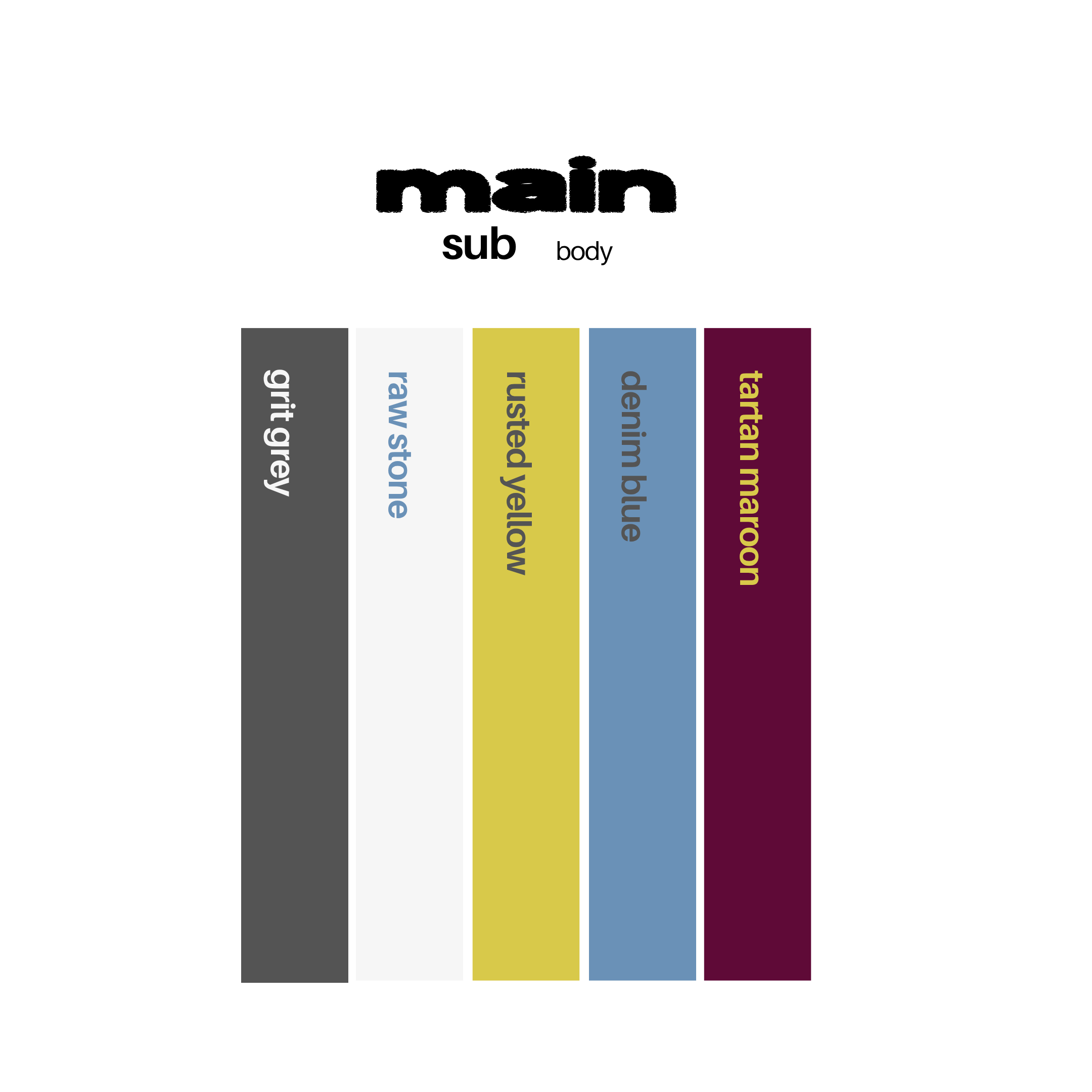
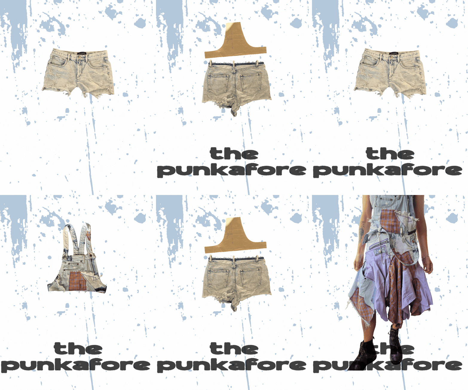
A new colour palette, typography pairing and graphic language built around collage, repetition, texture and controlled disorder.
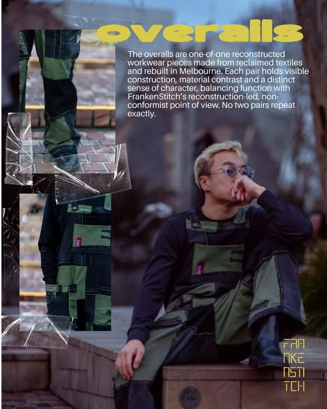
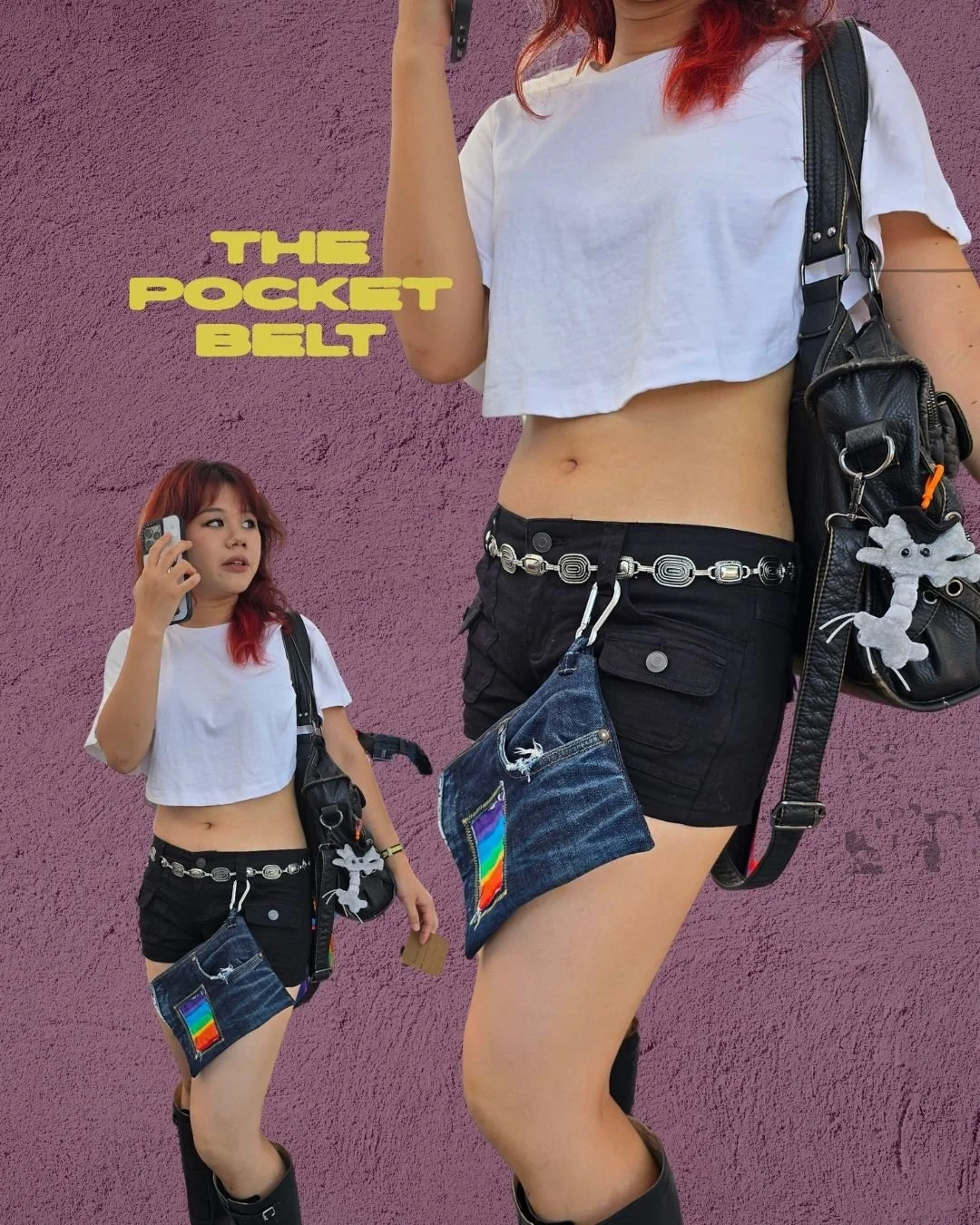
The work included product storytelling, reusable social assets, campaign graphics, market signage and banner designs. Each format was built to show why the pieces mattered: where the material came from, what had been done to it and why no two outcomes could be the same.
“Irigai's knowledge and direction has already strengthened my brand and opened up paths that I was unsure of before.
It has given me the platform and courage to push further and present with confidence wherever I am.
What was done for me and FrankenStitch was actually invaluable.”
- Gina, Founder of FrankenStitch
A visual system built to repeat without becoming predictable
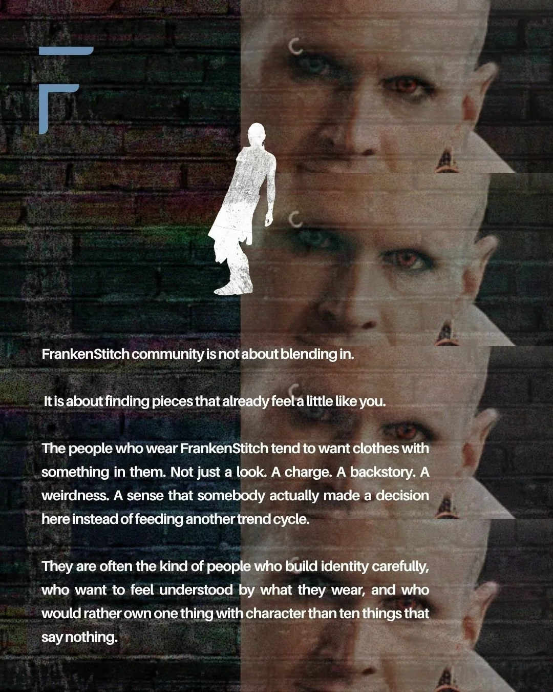
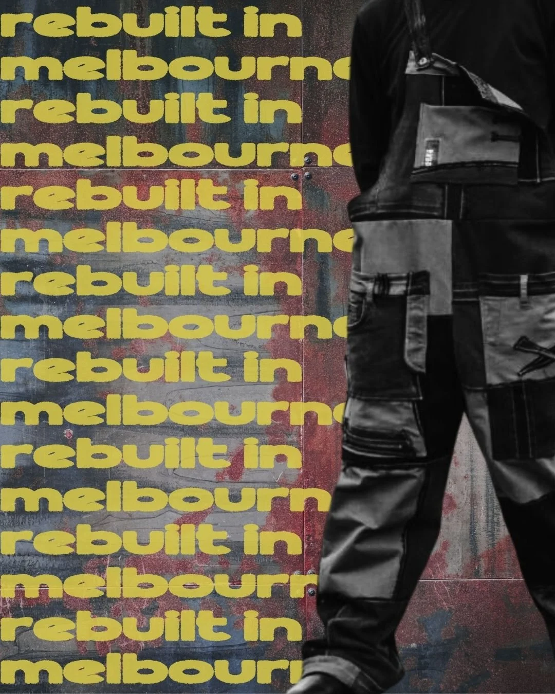
Punk, sci-fi, DIY culture and visible reconstruction became the basis of the system: a new colour palette, typography, collage treatments, distressed textures and graphic styles designed to feel raw, deliberate and recognisably FrankenStitch.
The system expanded into reusable social templates, product narratives, campaign graphics, signage and banner designs, giving the brand more consistency without stripping out the tension, irregularity and one-off character at the centre of the work.
Would you like to discuss an Eos strategy?
To talk to us about a strategy or find out more about any of our services, get in touch with us.